Overview
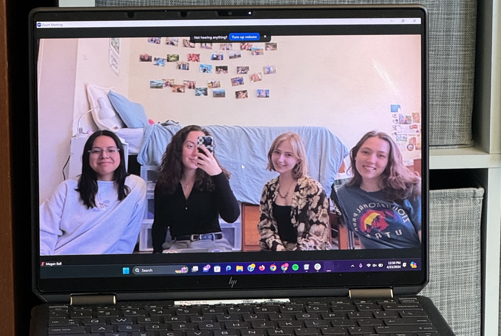
The goal of this project was to design a home page for the startup Warp that serves as an aggregator to allow for increased discovery and usage of Warp's features. My team worked directly with the founders to create this design.
My Role
I worked particularly on creating the low-fi and high-fi wireframe mockups in Figma with a focus on clarity and customizability. My team worked collaboratively throughout the process, each giving constant input and feedback.
What is Warp?
Warp is a reimagined command-line terminal: an AI-driven platform with collaborative tools that allows developers to efficiently code in the terminal and work together. We were tasked with designing its home page.
Problem
Warp does not have a centralized home page for users to view their files, teams, usage, and account info, or to learn more about Warp. Most of this information is housed in settings, making it difficult and unintuitive to find, especially for new users who are unfamiliar with the Warp system.
Solution
A centralized home page that adapts to a user's state (new vs. seasoned) to give efficient access to their work, teams, personal information, and educational resources, making Warp easier to navigate and more approachable to new users.
Early Sketching
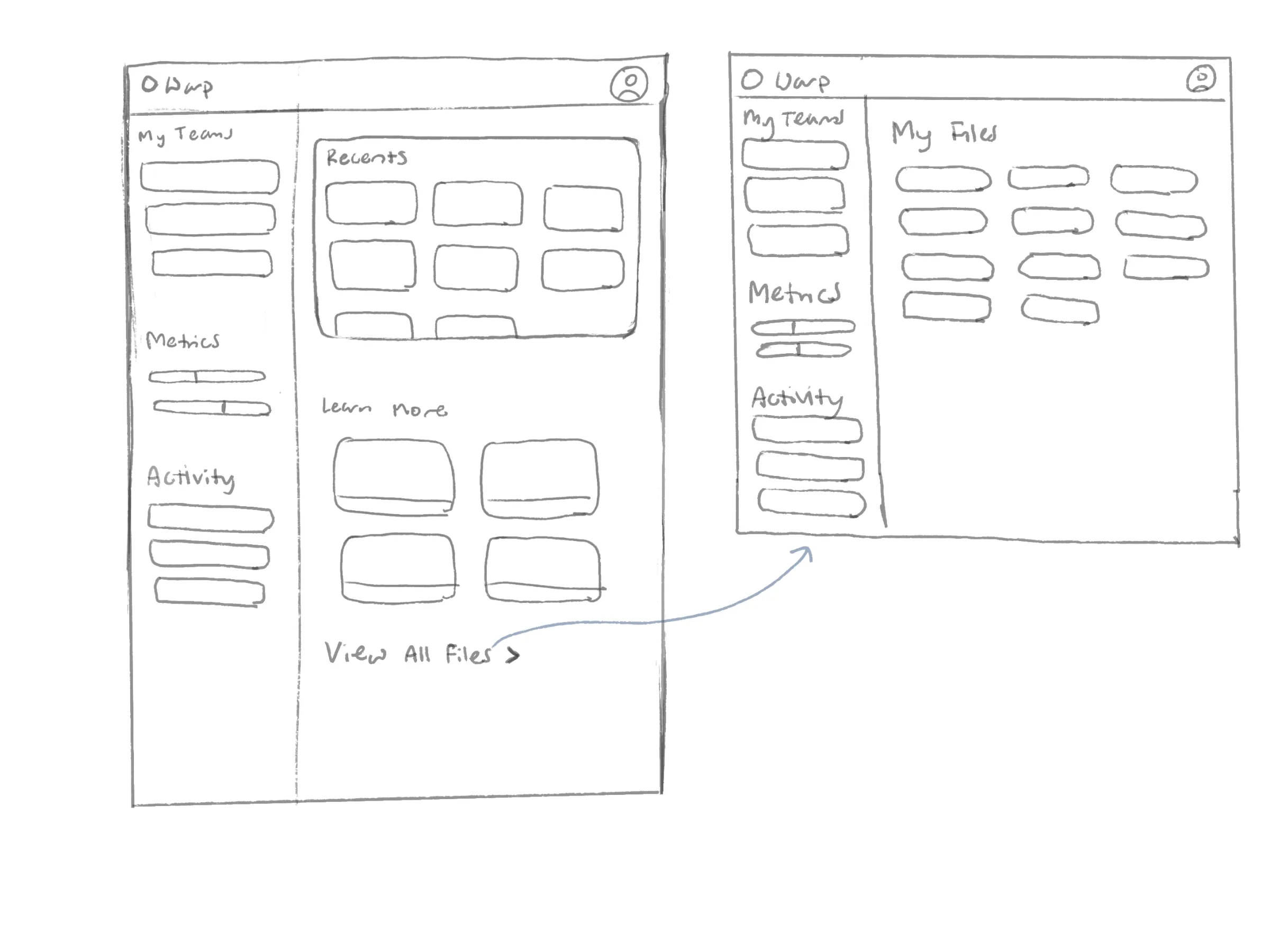
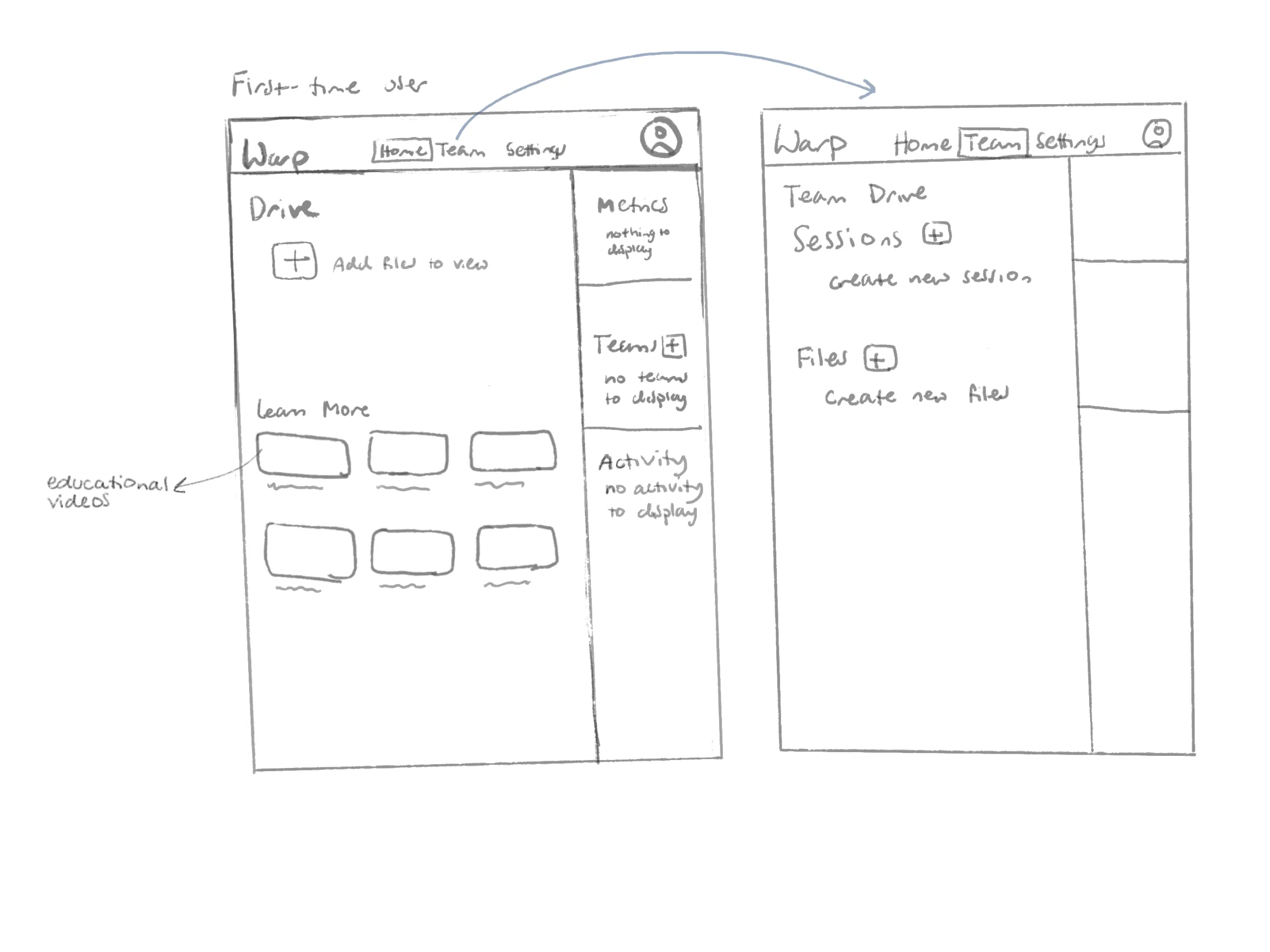
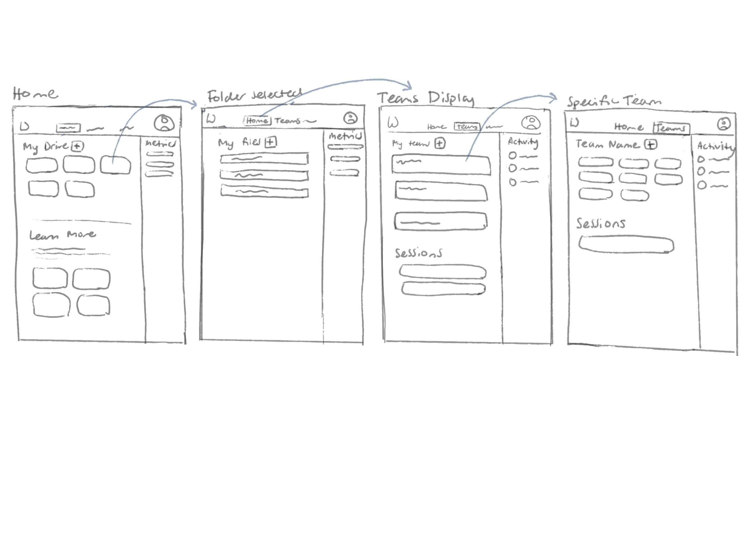
I began by creating sketches to explore different layouts for the screen and modules:
Design Decisions
Based on the initial sketches, the following focuses were implemented into our wireframes:
- Focus on intuitiveness with inspiration from Figma Home, Google Drive and GitHub home
- Centralize live sessions, user metrics, activity, and educational content with use of a sidebar
- Consideration of user states (both new and active users)
- Focus on customizability
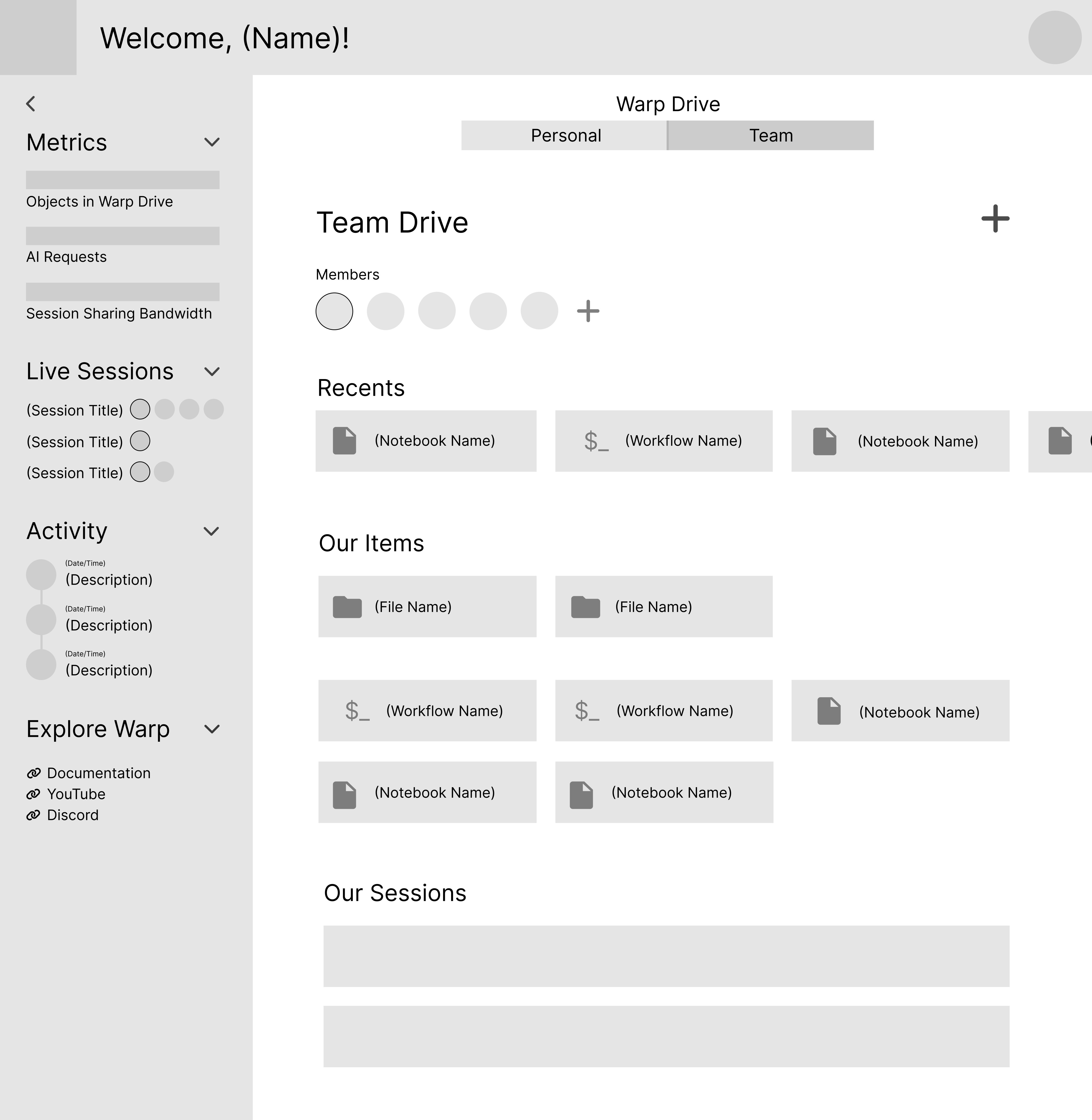
- Split up team and personal functionality
First-Iteration Wireframes
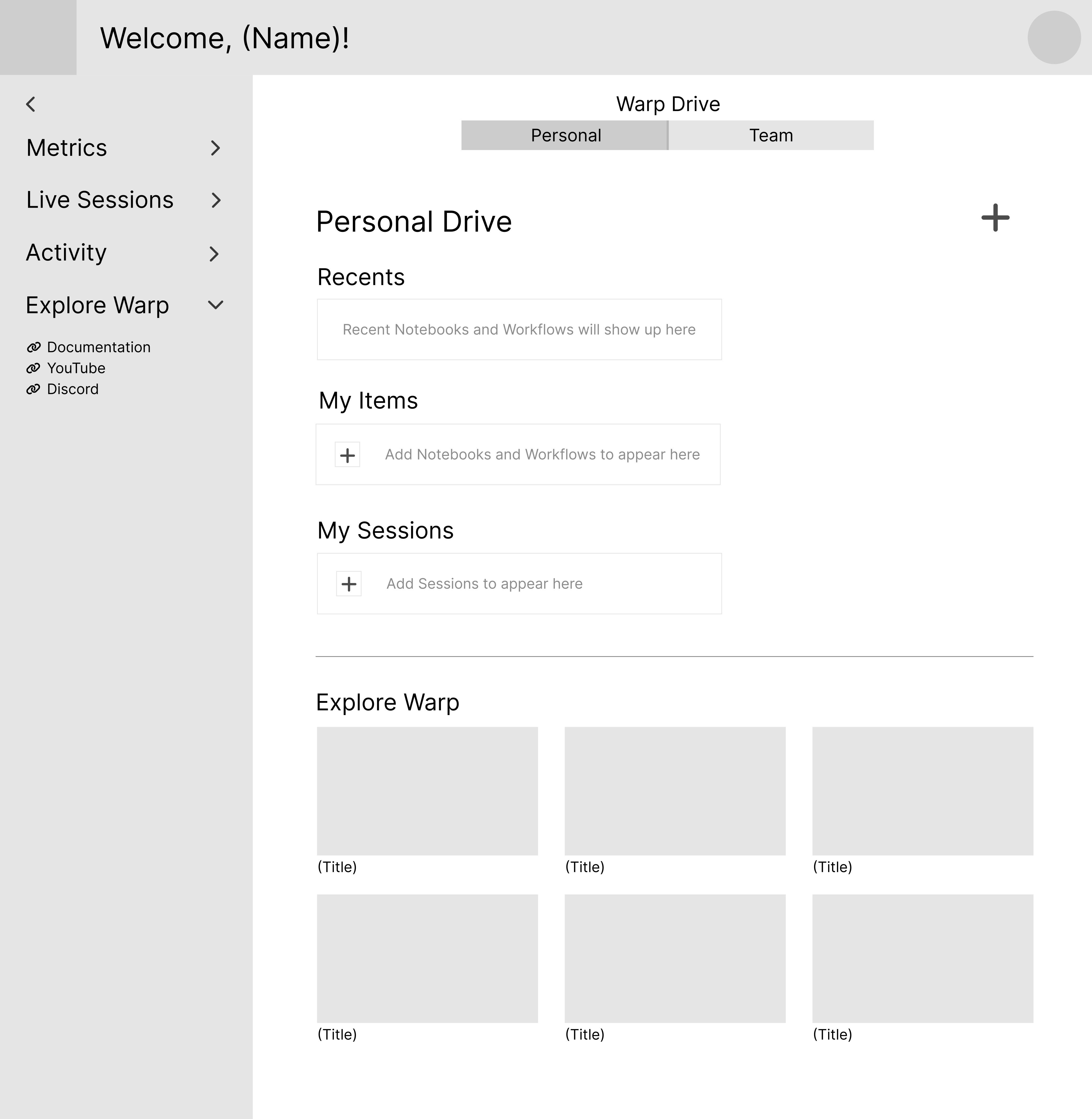
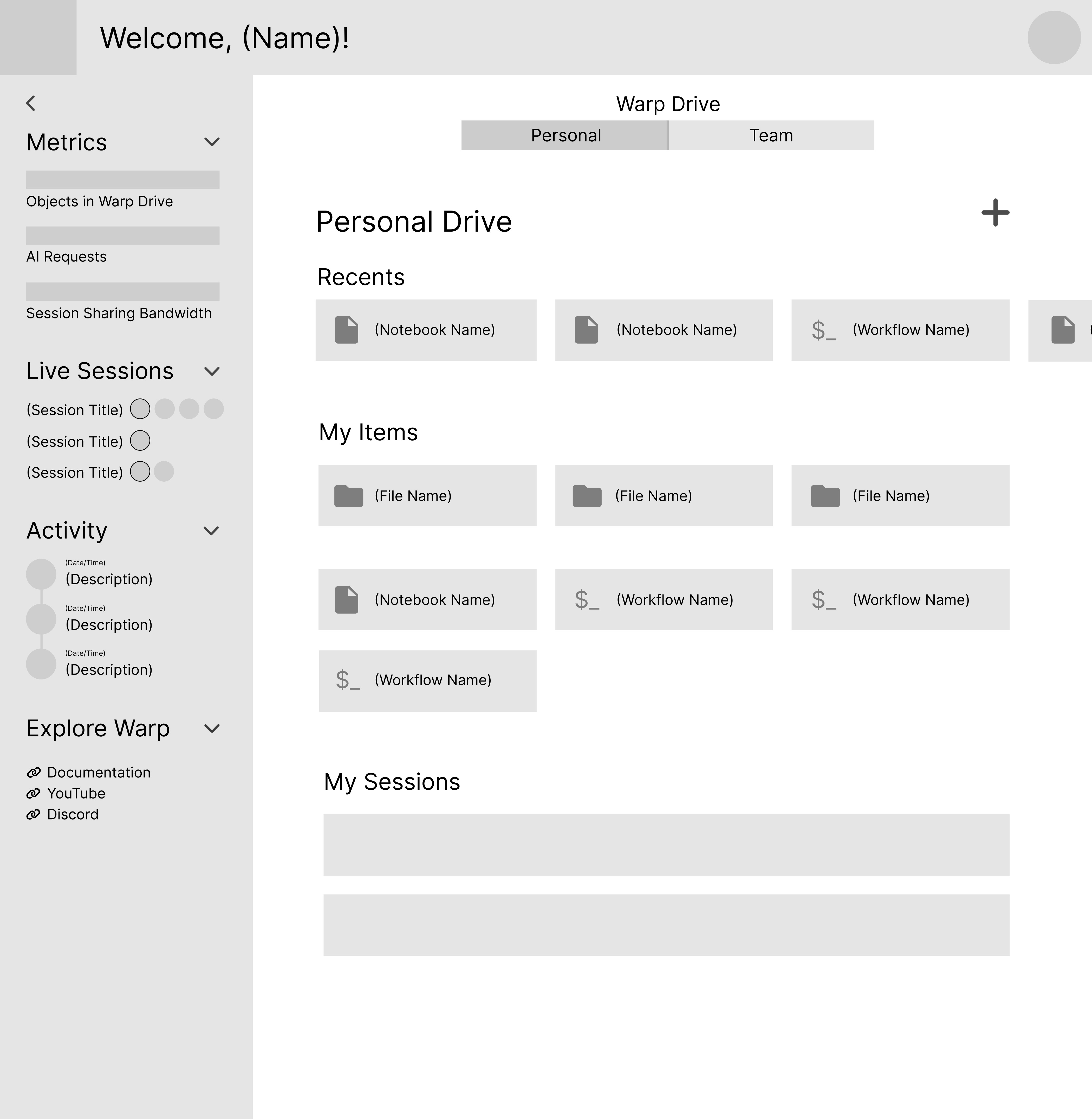
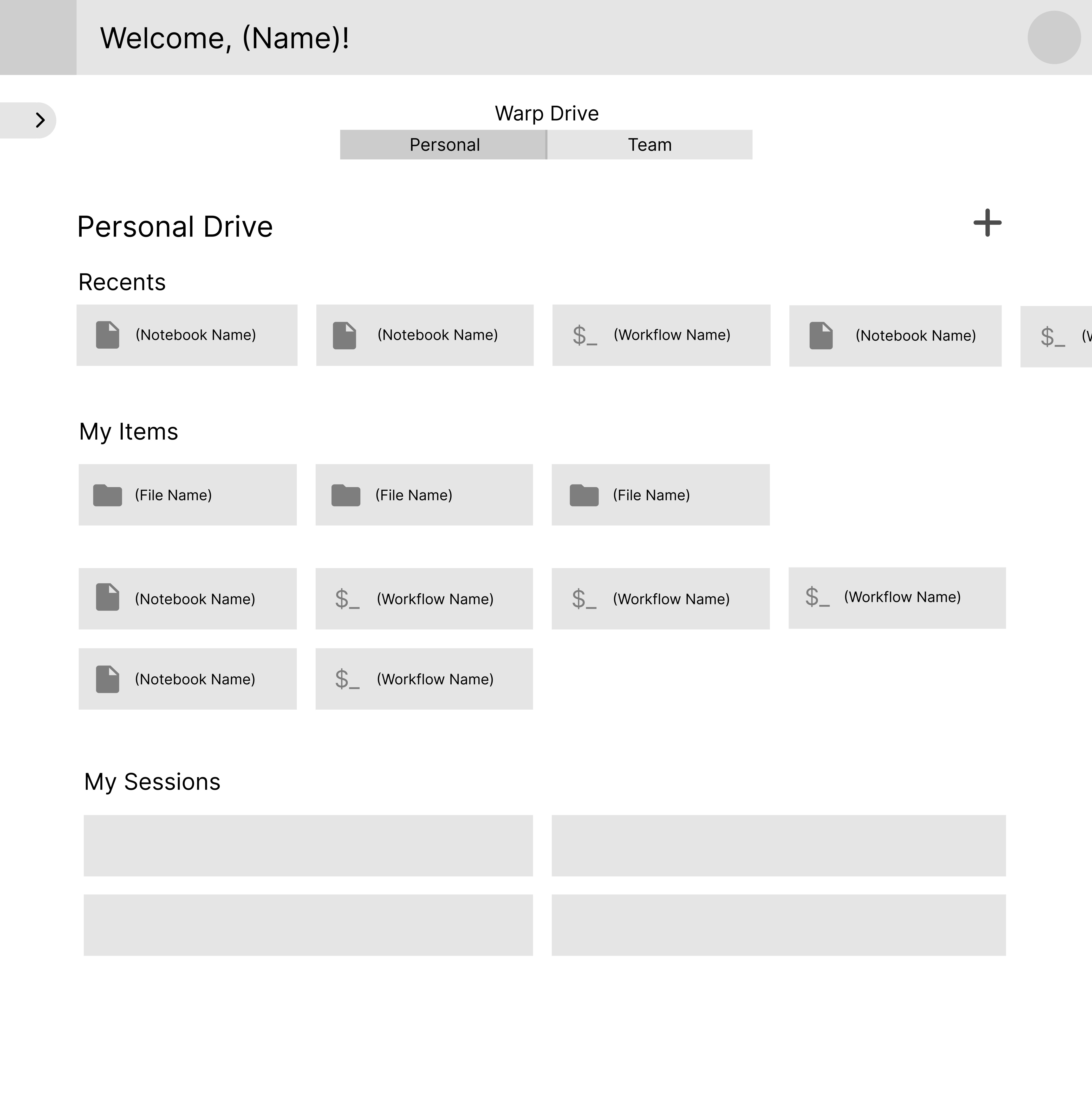
The goal was to create a user-friendly, glanceable interface that allows users to understand their current state and easily access their content.
Layout Strategy
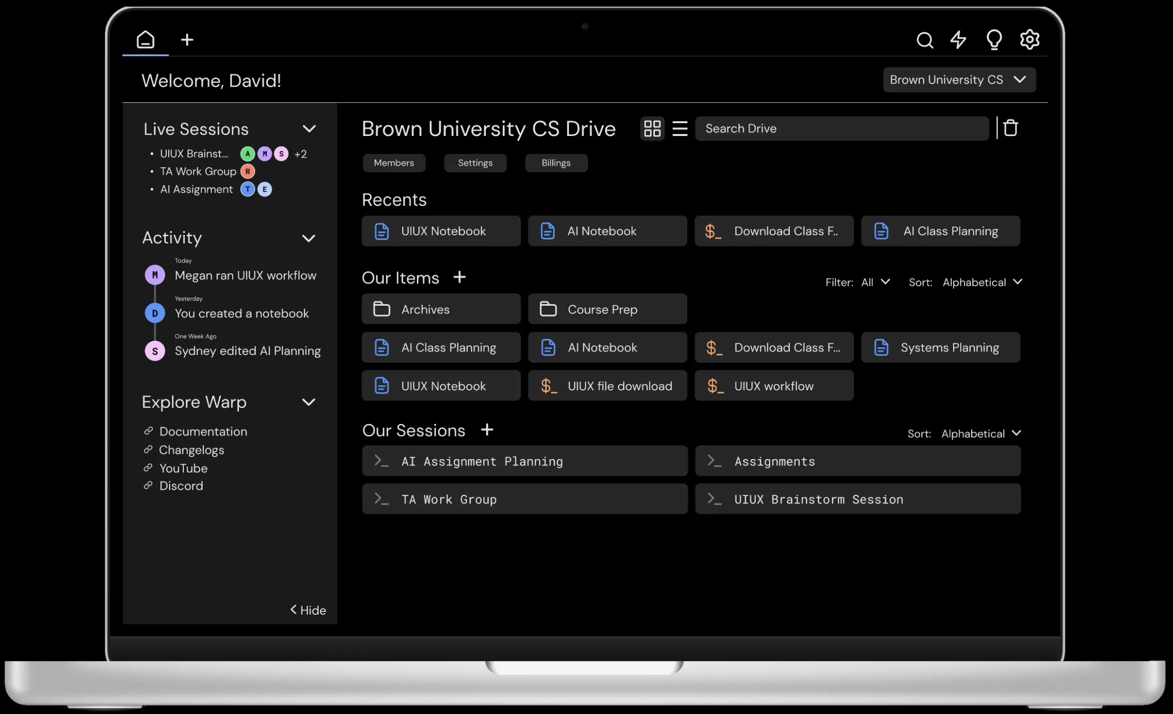
We used a split layout: the left sidebar displays metrics, live sessions, activities, and resources, and the main section displays folders, files, and sessions. Since Warp is designed for collaboration, it was also critical for users to seamlessly switch between personal and team views.
Low-Fidelity Wireframes
Revisions
Based on feedback from the Warp founders as well as peers, we revised our initial drafts with the following in mind:
- Four screens were too few to demonstrate user interaction, so we created more screens.
- We removed metrics from the left sidebar to clean it up, since users don't need to constantly see this information (it fits better in the account page).
- We made the drive more customizable by adding sorting, filters, and two viewing modes.
- We changed the "Personal" / "Team" toggle to a drop-down since the founders clarified that Warp will eventually allow users to be on multiple teams.
- To make it easy to move between the home page and the terminal, we added a top nav bar with a new home tab, replacing the drive tab since the drive is now integrated into the home page.
Revised Wireframes
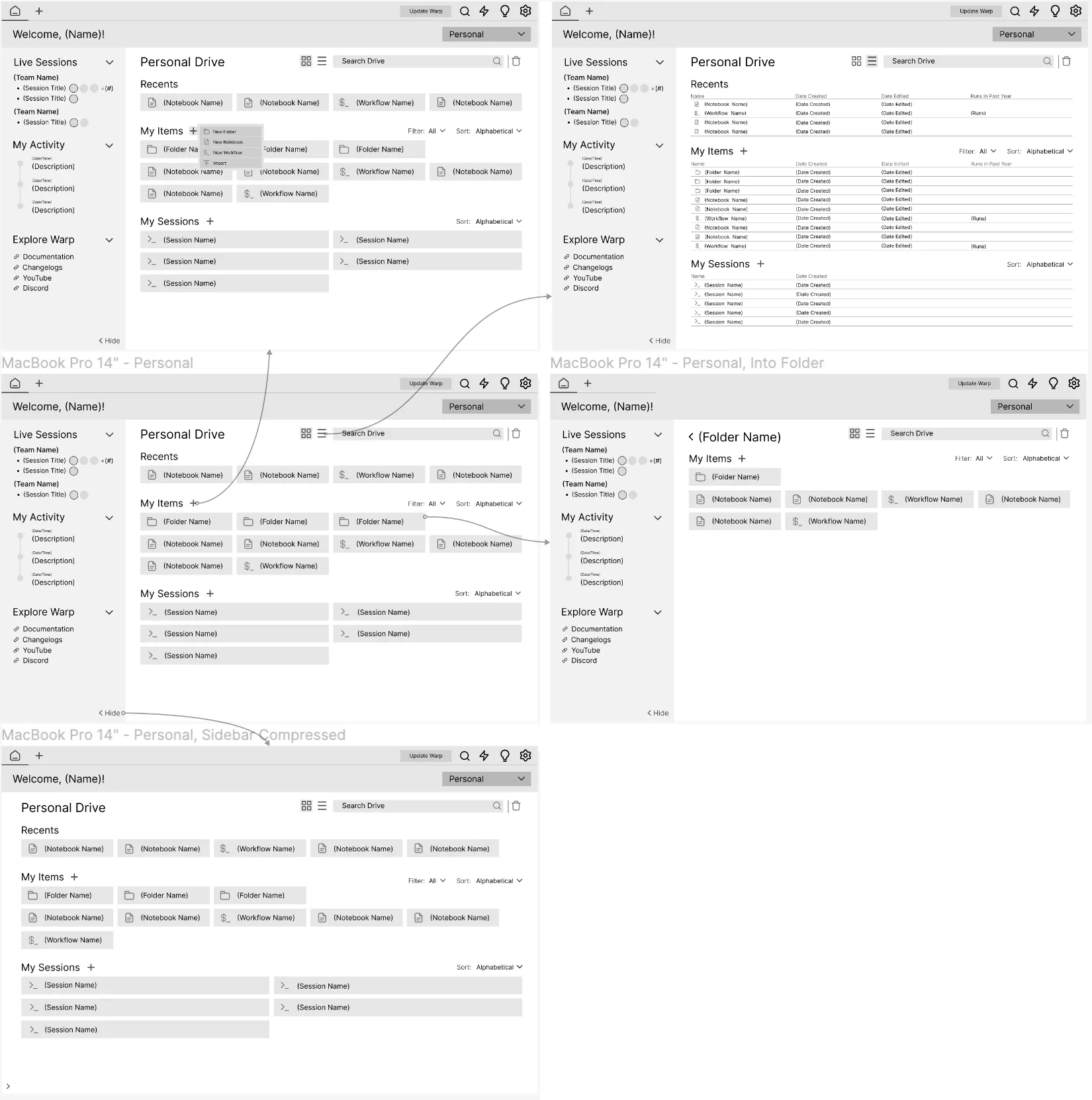
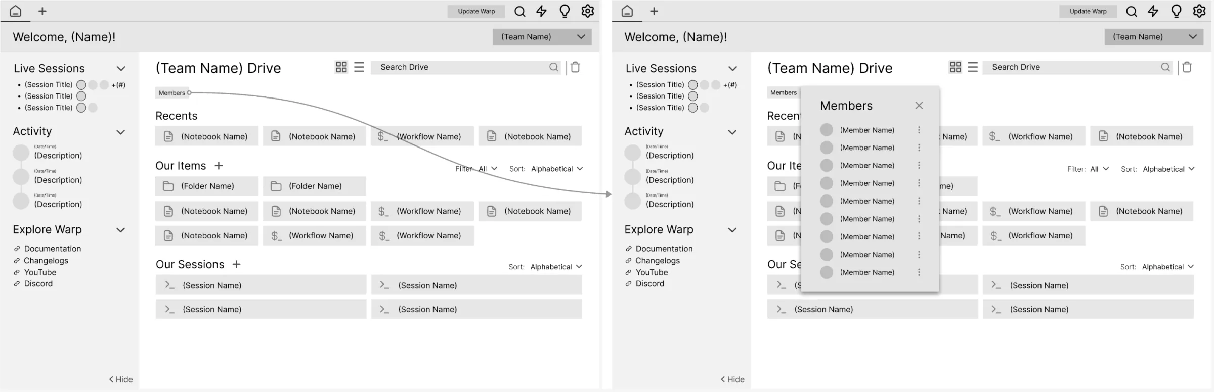
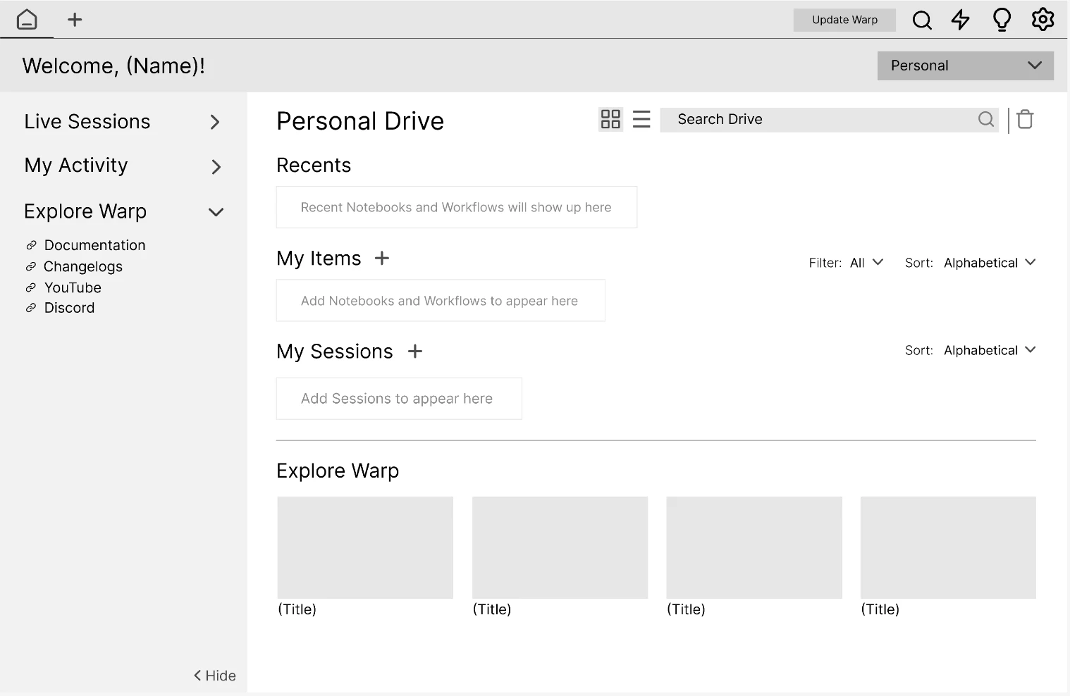
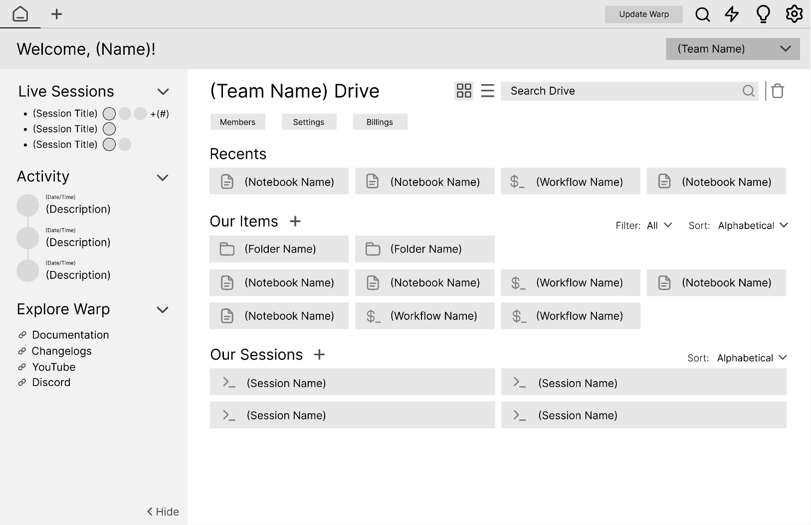
High-Fidelity Prototype
Style Guide
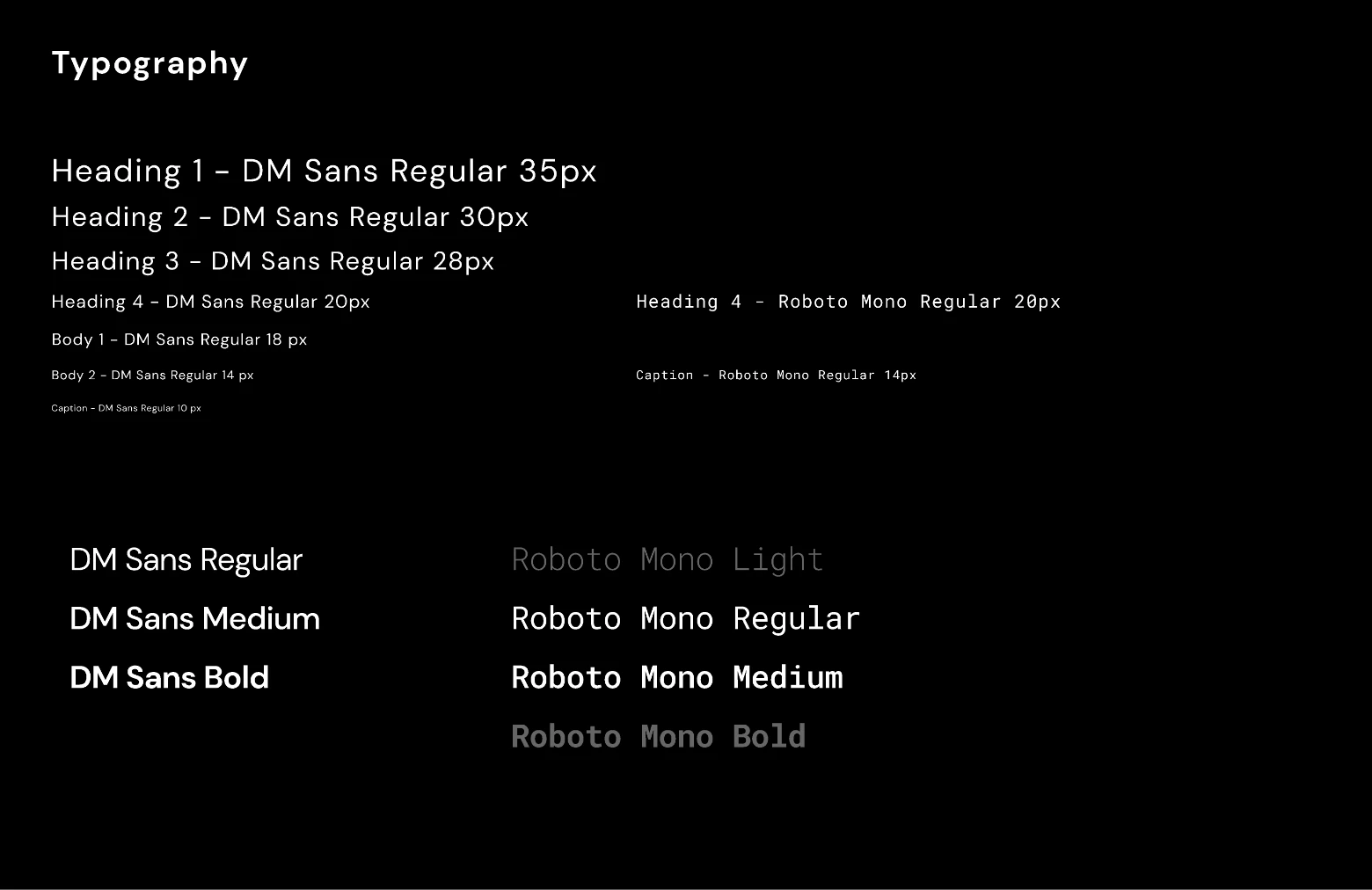
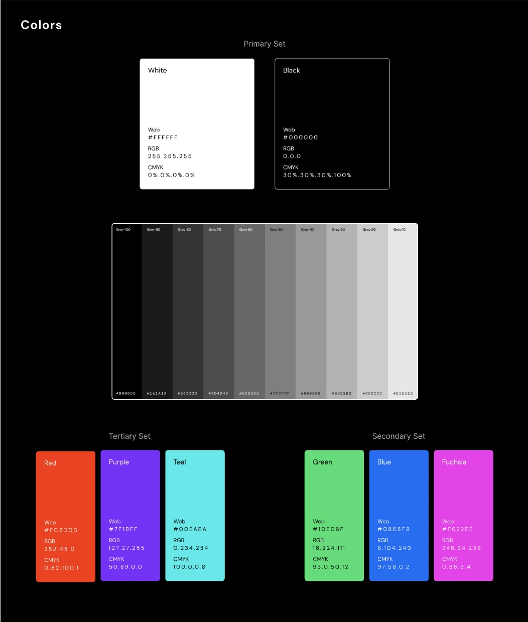
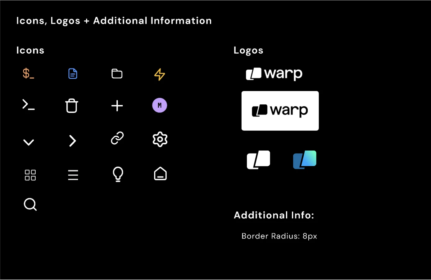
We based the style guide on the current Warp brand guidelines, adding specific font sizes and an icon library to match our design.
- The brand focuses on a minimal, dark-mode style, which works seamlessly for developers who often work in dark mode.
- Users are often online for long periods of time, so a minimal, professional, easy-to-read interface is critical.
- The main font is a simple, readable sans-serif, and the terminal font is similar to other macOS and Linux terminals, aligning with users' mental model.
- Warp uses mostly black and white in varying shades, with accent colors that create fun, eye-catching elements that make Warp more than a basic terminal.
We also checked the style guide against WCAG and found that dark gray on black could be an issue, so we increased the contrast between text, buttons, and the background for accessibility.
Final Prototype
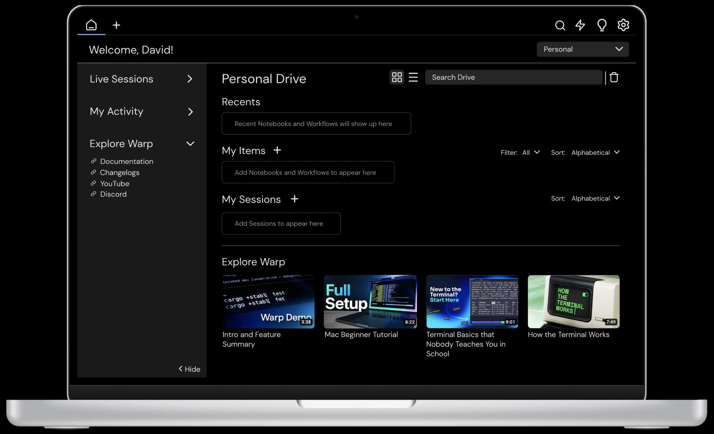
Our prototype uses the same structure as our final wireframes, with new colors, fonts, and icons from our style guide to bring the design to life. It shows how the home page adapts to the user's state and the actions they can take.
Design Principles
We emphasized key design principles to fulfill our users' needs and ensured that our design aligns with the mental model users already have of a home page or dashboard.
We used hierarchy to create an efficient layout based on the F scan pattern, where users scan horizontally across the top, then vertically down the left side, and finally across the screen. The welcome and navigation sit across the top, the sidebar with key information on the left, and files in the center, so users can quickly find what they need. I also ensured sufficient contrast for accessibility.
Next Steps
In our final meeting with the Warp founders, we received a lot of praise as well as useful feedback that I hope to implement to revise the design and inspire future projects:
- Think about what will happen when the sidebar fills with activity. How will it stay clean and clear?
- Consider the order of content for new users; perhaps educational content should come first, with the page updating as the user becomes more experienced.
- Explore where the members, settings, and billing buttons would direct an admin.
Reflections
This project taught me a lot about designing as a team and working with clients to achieve a design goal. Communication was a huge part of the process, both within my team and with the founders. From the beginning, I prioritized understanding our client's needs and expectations through active listening, thoughtful questions, and thorough documentation of their feedback.
A key challenge was translating their vision into tangible designs, which required creative problem-solving and a deep understanding of design principles and user experience. My team continuously iterated on our designs, aligning with their expectations while incorporating our own expertise and insights.