Product design for Brown CS’s Socially Responsible Computing (SRC) program
Project Focus
Product design, accessibility, leadership
My Role
Staff Designer → Lead Product Designer
Client
Brown University CS Program
Overview
I was hired by Brown University’s Computer Science Department through the
Socially Responsible Computing (SRC) program to design the SRC Handbook—
a digital resource that helps CS students, TAs, and professors teach and learn a more
ethical, socially conscious computer science.
The handbook is built by two kinds of teams. Primer teams own each subject area—
Accessibility, Automated Decision Making, Privacy, and more to come—and conduct
research and write the handbook copy. A small product team designs and develops the
digital experience that makes that content usable, findable, and approachable. Because
socioethics knowledge keeps changing, the project is designed to keep growing as new
primers and subjects are added over time.
My Role
I started as a staff designer, then stepped into the lead product
designer role—refining the branding, building the design system, developing assets, and
supporting development.
What is Socially Responsible Computing?
Socially Responsible Computing (SRC) is more than technology ethics. It is an interdisciplinary
effort to use the perspectives and tools of the humanities and social sciences to identify and
scrutinize the social impacts of computer science, in an effort to build technologies aligned
with human needs and values.
SRC education at Brown aims to:
Build awareness of the social, ethical, and political context of technology
Enable students to make concrete technical decisions informed by that analysis
Foster a socio-technical mindset as a standard part of computer science practice
Problem
Materials on ethics and social impact in CS are often scattered and hard to use in teaching.
How do we make them easier for students, TAs, and instructors to find and apply?
Solution
A modular digital handbook with clear navigation and approachable primers so socioethics
topics can be taught and learned without prior specialty knowledge.
Design Decisions
Structure
Focused on page hierarchy and readability—and room for the handbook to grow over time.
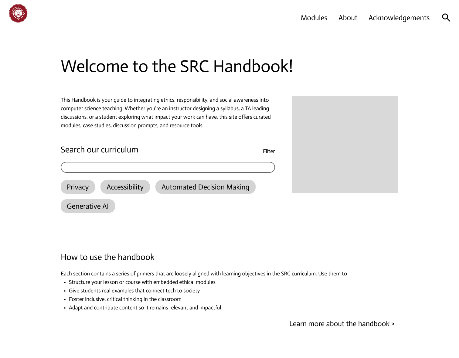
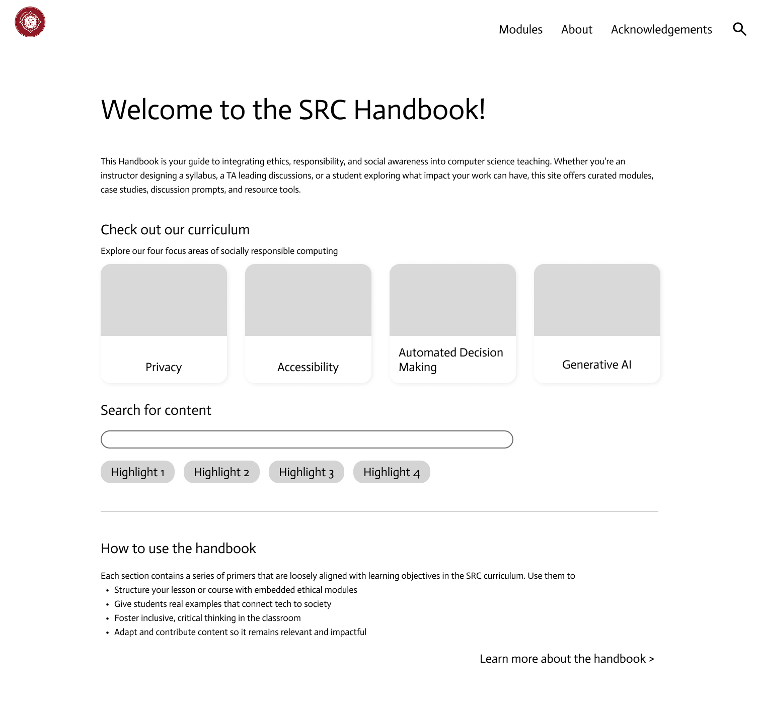
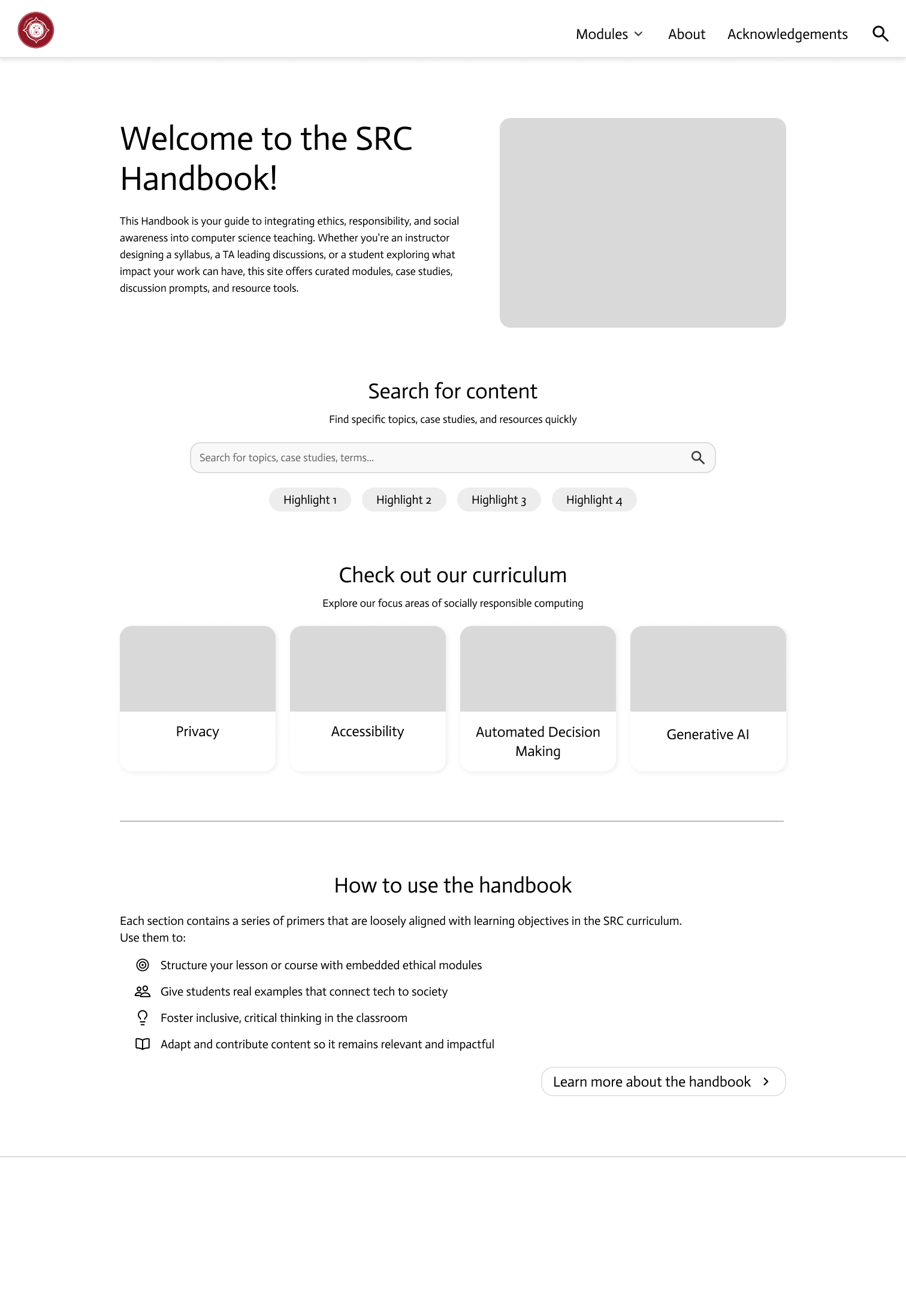
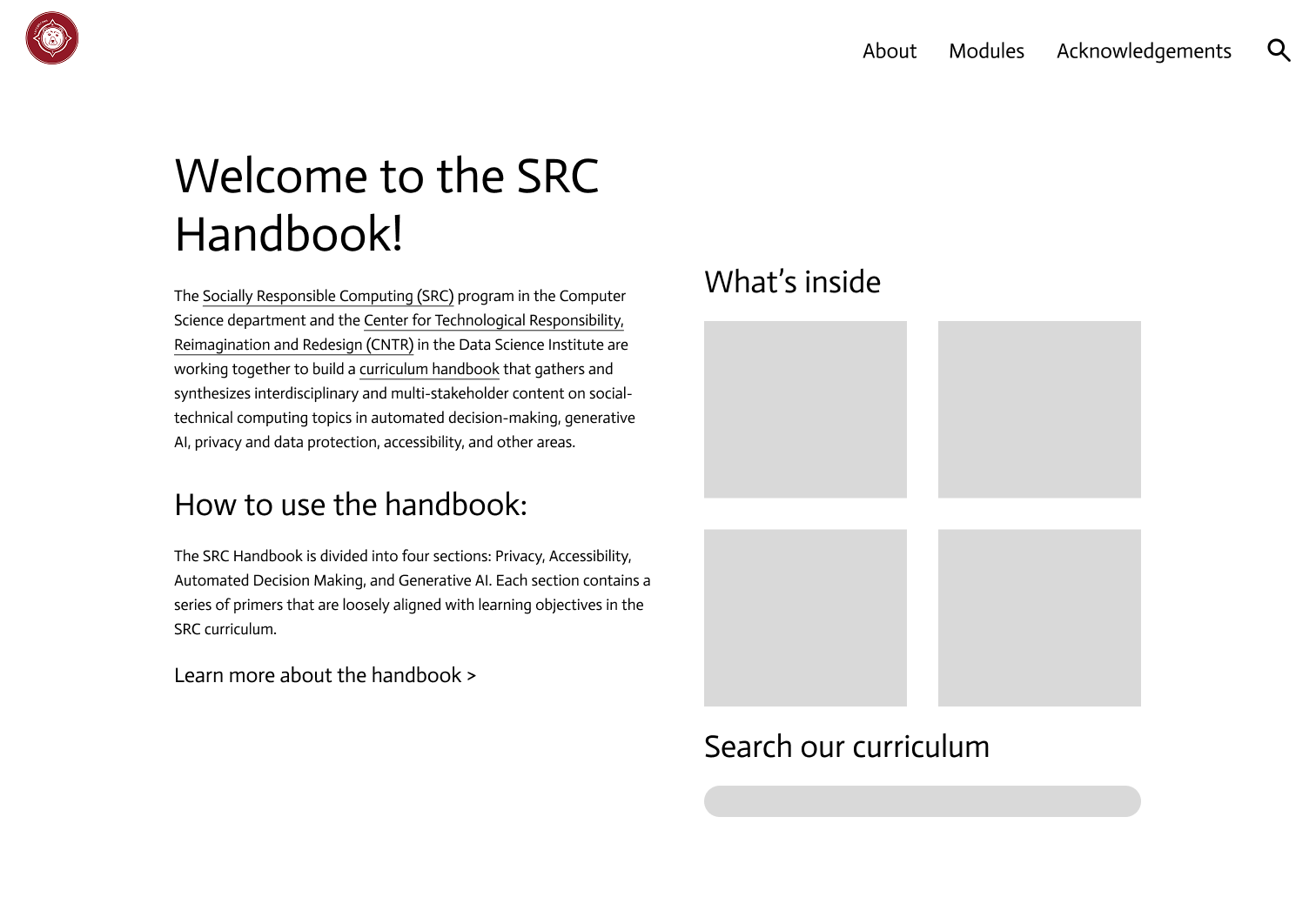
Options explored
Option AOption BChosenOption D
Why
I selected lo-fi 3 to focus on page hierarchy and readability—so the handbook feels
approachable rather than overwhelming—and to leave room for the content to grow and
expand in the coming years.
Accessibility
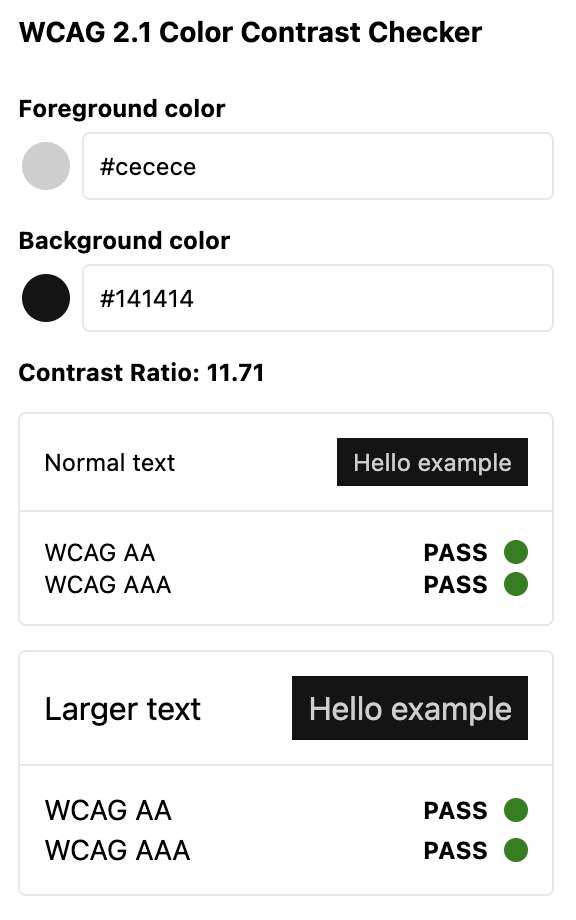
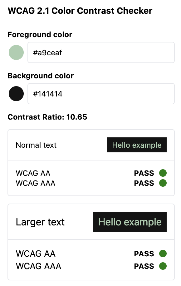
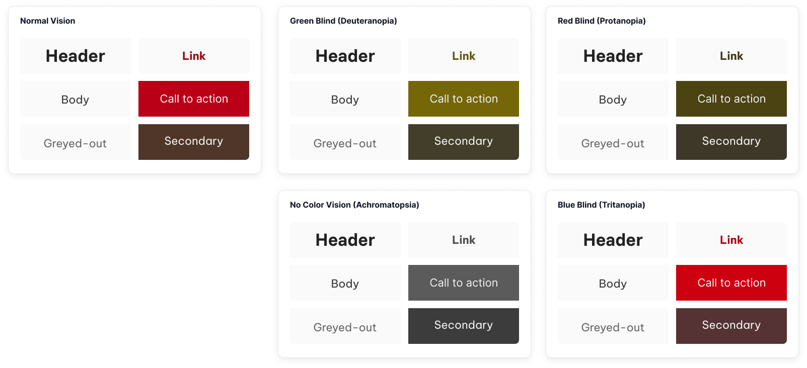
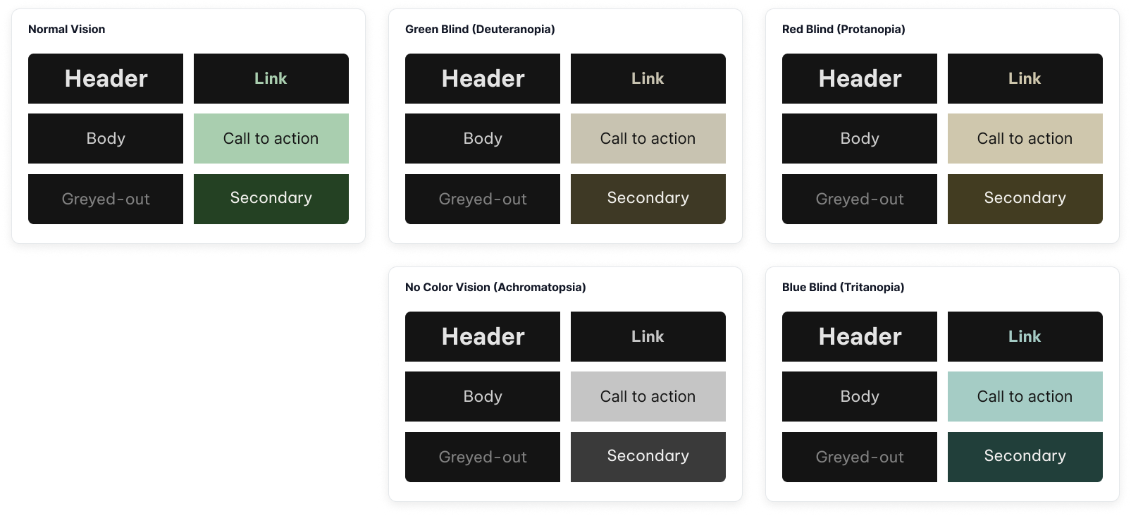
Built in from the start—not as a late fix. Contrast, color-vision checks, and readable modes led palette and UI decisions.
What that meant in practice
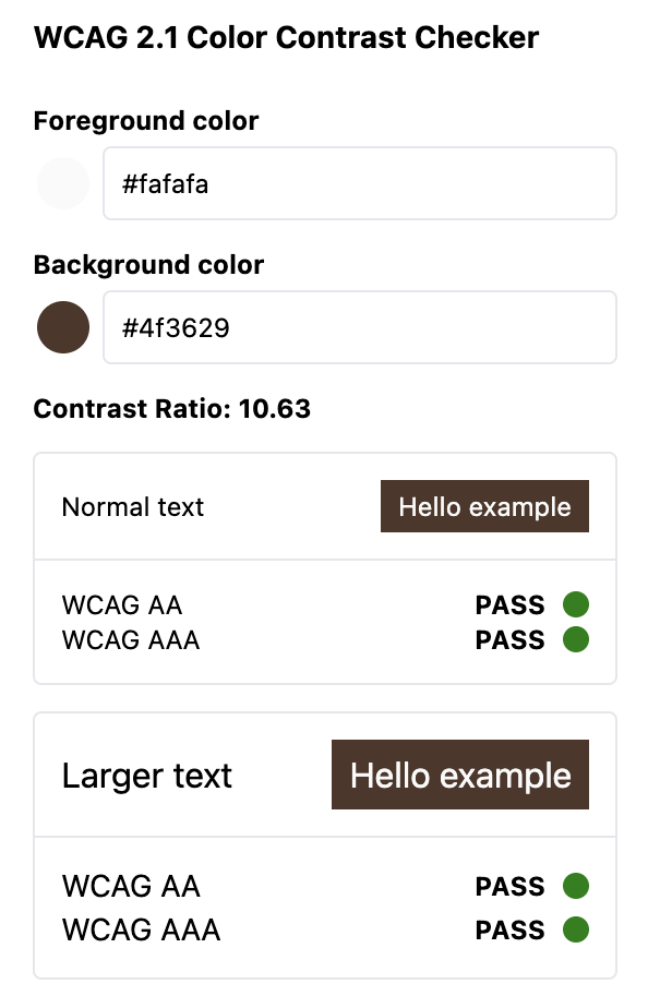
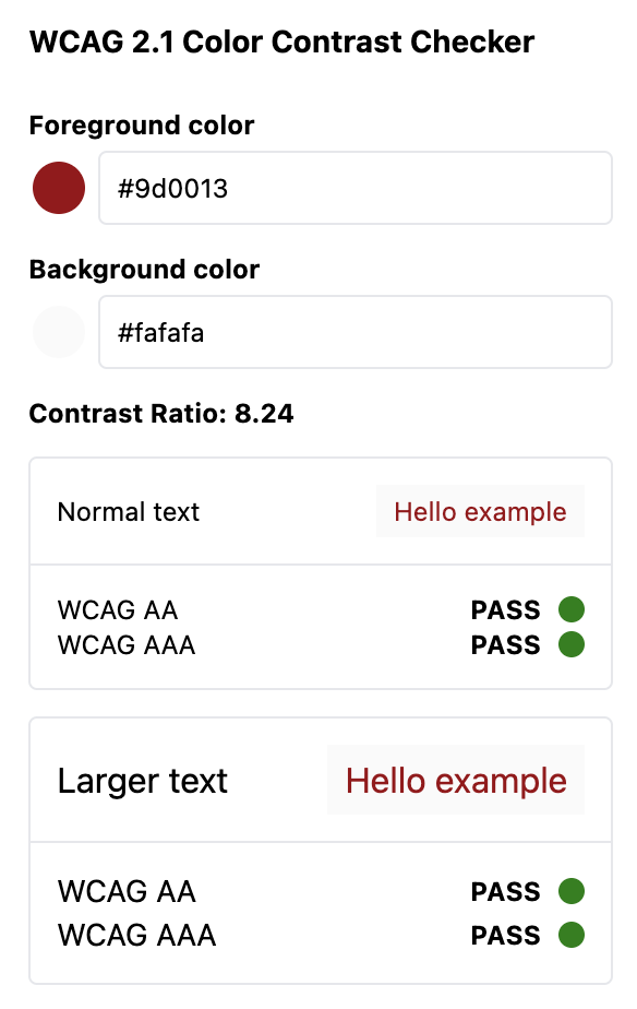
Accessible color palette — selected colors with sufficient contrast for
text and key UI elements.
Color-blindness checks — verified the palette remained usable under common
color-vision deficiencies, not only for “average” vision.
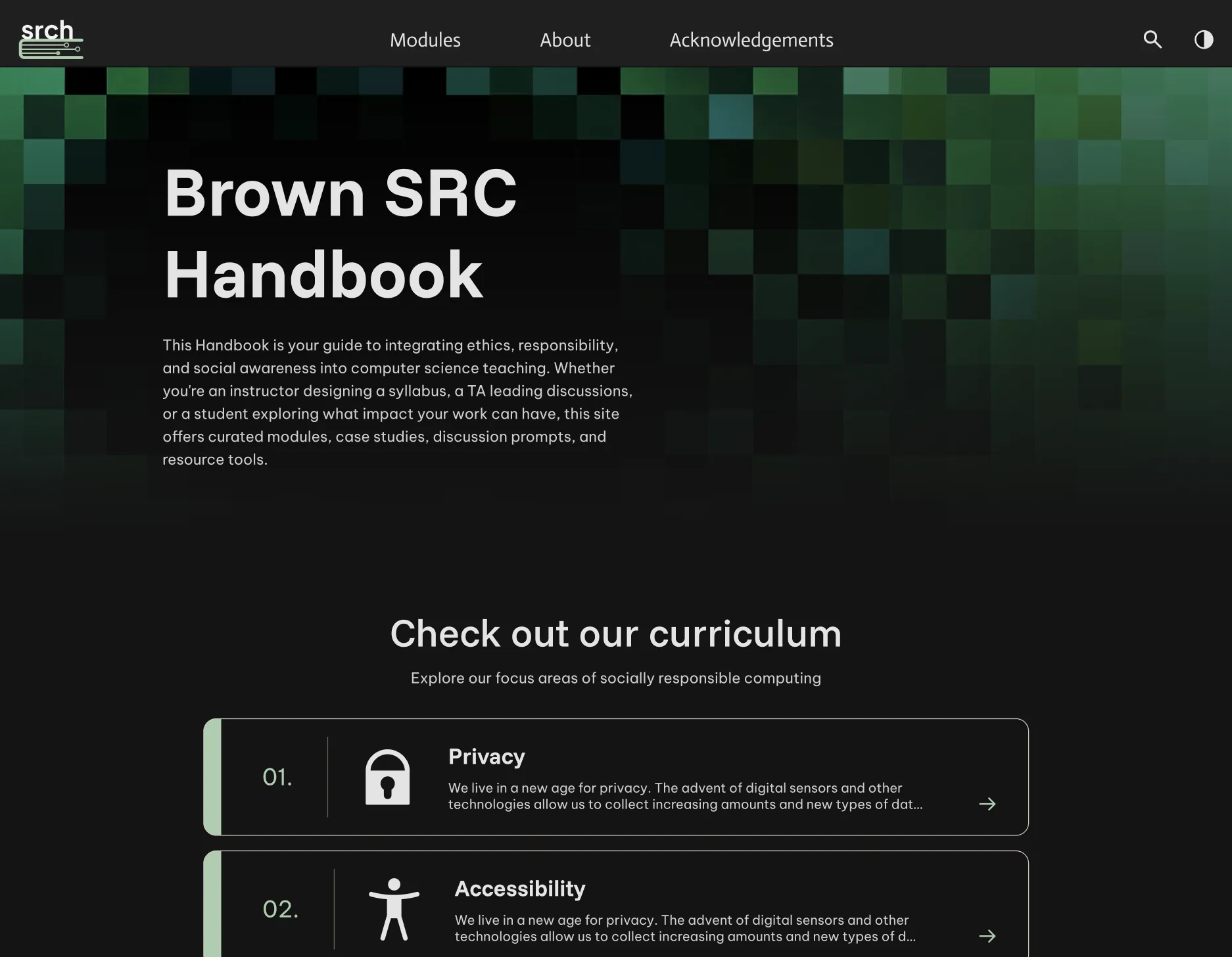
Light and dark modes — offered readable environments for different
preferences and lighting conditions, using the same contrast standards in both.
Why
SRC content is meant for a broad academic audience. If color, contrast, or mode choices
exclude readers, the handbook fails its educational purpose. Accessibility led palette,
UI state design, and light/dark reading modes.
Tested with students and assistive-technology users through TheWeCo—then iterated on what failed in practice.
How we tested
Student usability testing — sessions with CS students (the handbook’s primary
users) to check approachability, findability, and classroom fit.
TheWeCo a11y testing — separate moderated sessions with people using NVDA,
JAWS, Dragon NaturallySpeaking, and sighted testers. I moderated and captured findings using
TheWeCo’s
Guide Your Own Usability Test.
Why
Contrast checks weren’t enough. We tested with the people the handbook is for—students—
and with assistive-technology users through TheWeCo, so both primary use and accessibility
showed up in practice.
TheWeCo findings
Visual design & dark mode — approachable overall; dark mode contrast
preferred. Hierarchy in dense primers still needed work.
Search — biggest blocker: hover-fragile nav search, weak AT feedback, and
results that were hard to tell apart.
Sidebar focus — case-study links often opened with no announcement and no
focus move into the panel.
Alt text — some graphics under-described, others over-described; testers
wanted short IDs with longer explanation nearby.
Wayfinding — missing page-load cues, link vs. button confusion, and
footer/sidebar traps.
Design Revisions
Student feedback and TheWeCo findings both informed iteration. Priorities included search
reliability and feedback, sidebar focus and announcements, clearer information hierarchy,
stronger alt text, and AT navigation fixes.
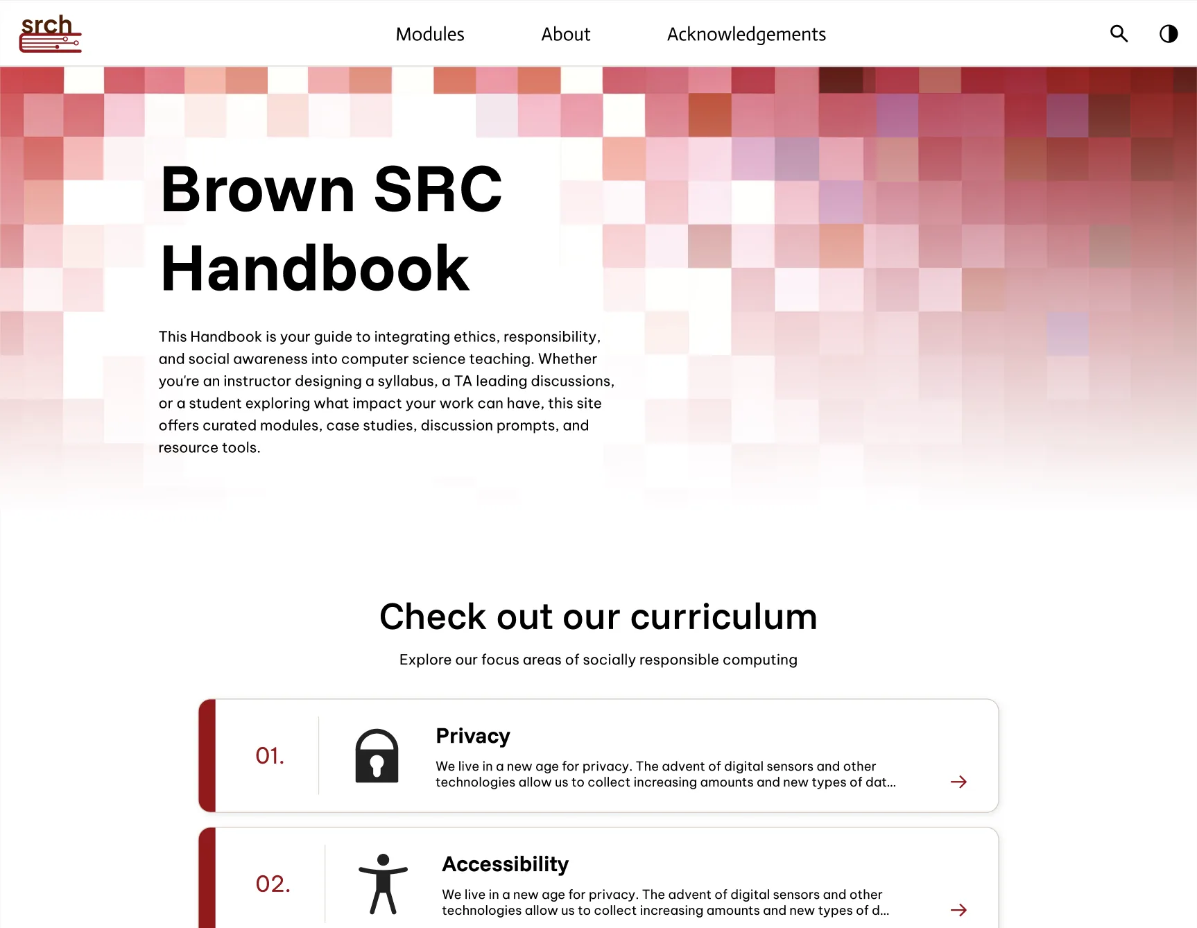
Homepage scrollStudent testing
Revised layout and content flow based on how students explored the site.
BeforeAfter
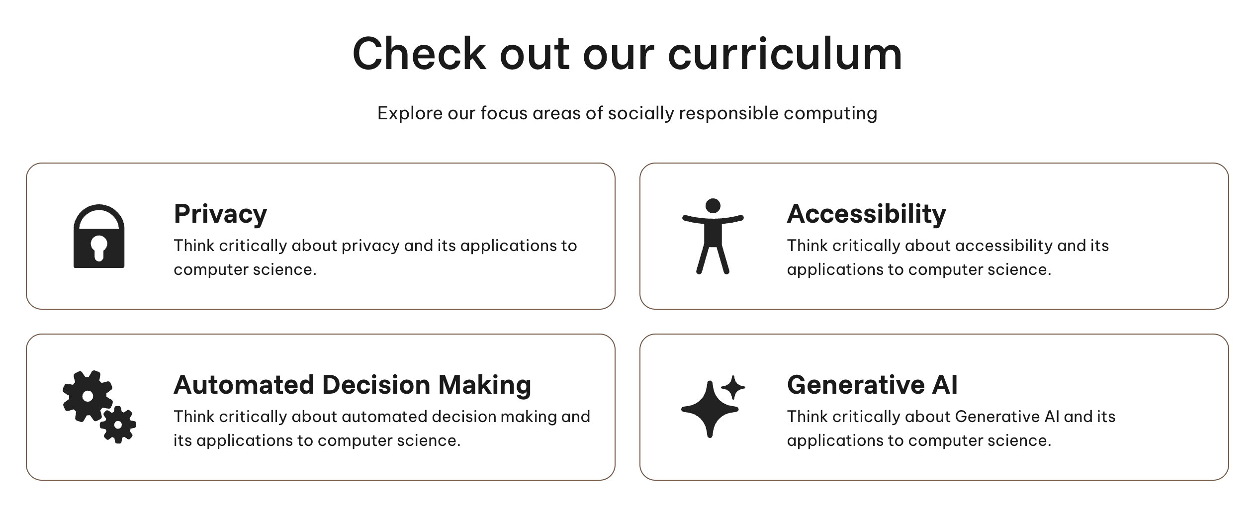
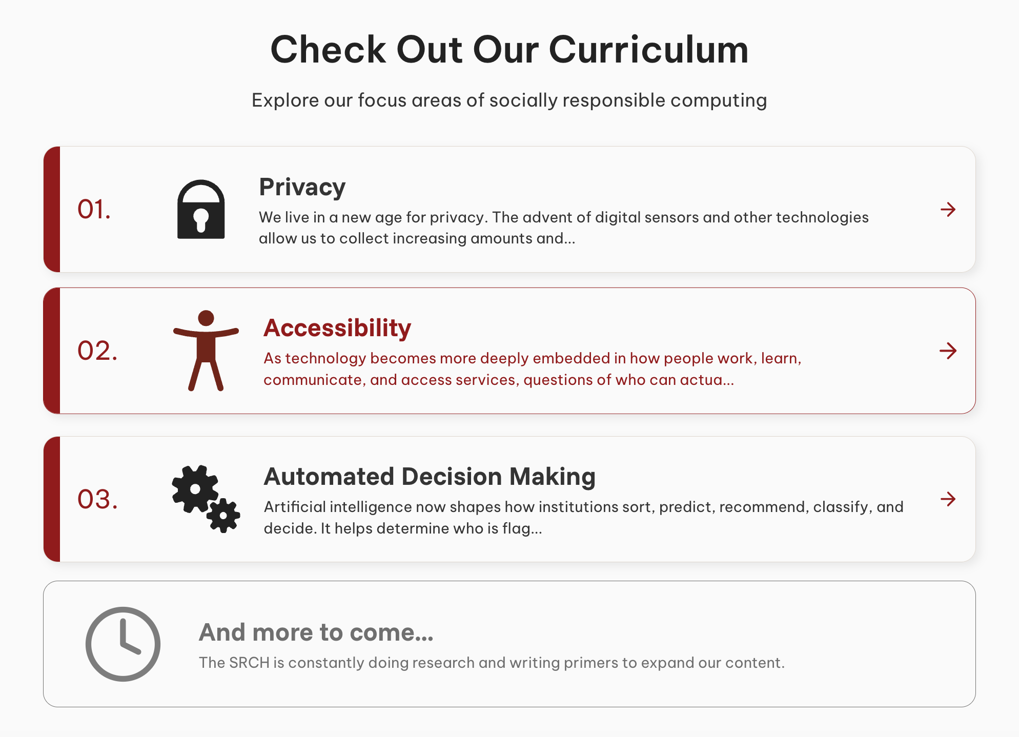
Curriculum focus cardsStudent testing
Numbered cards with module context replaced icon + one-liner tiles.
BeforeAfter
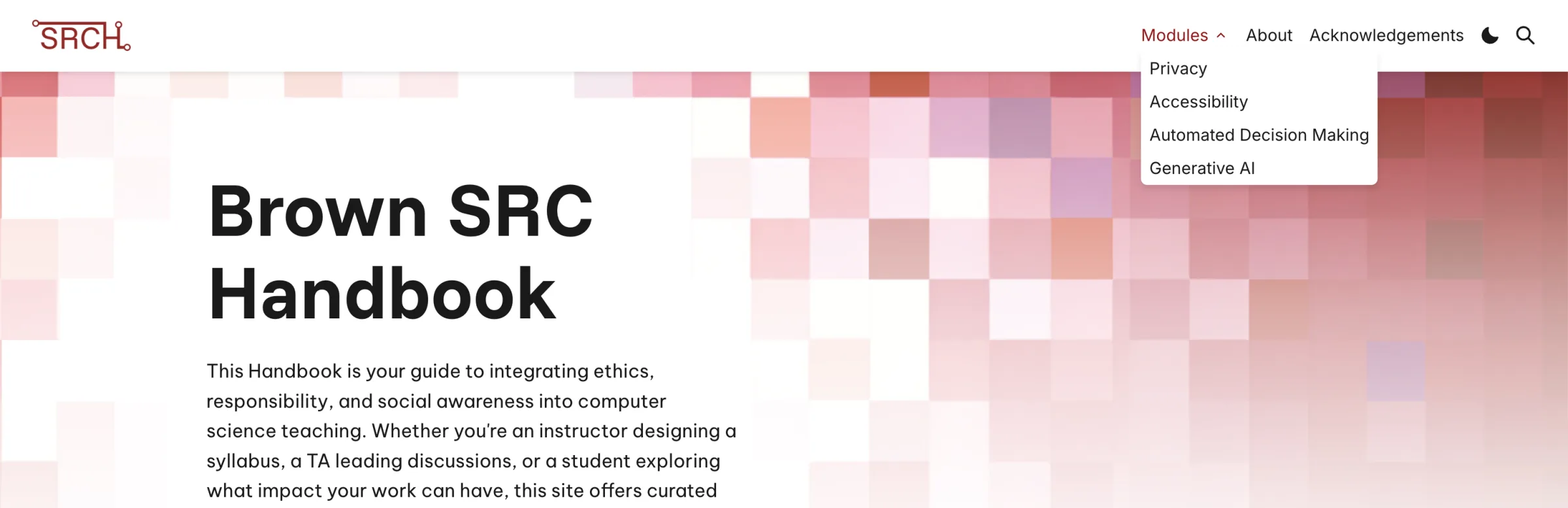
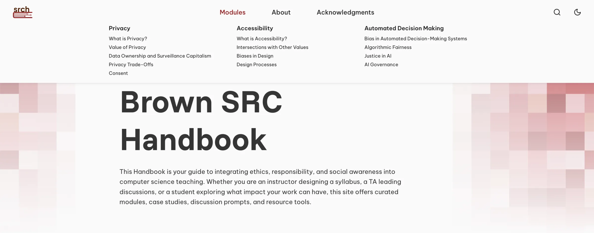
Modules dropdownTheWeCo a11y testing
Flat link list replaced with a mega-menu so users can scan primers before navigating.
BeforeAfter
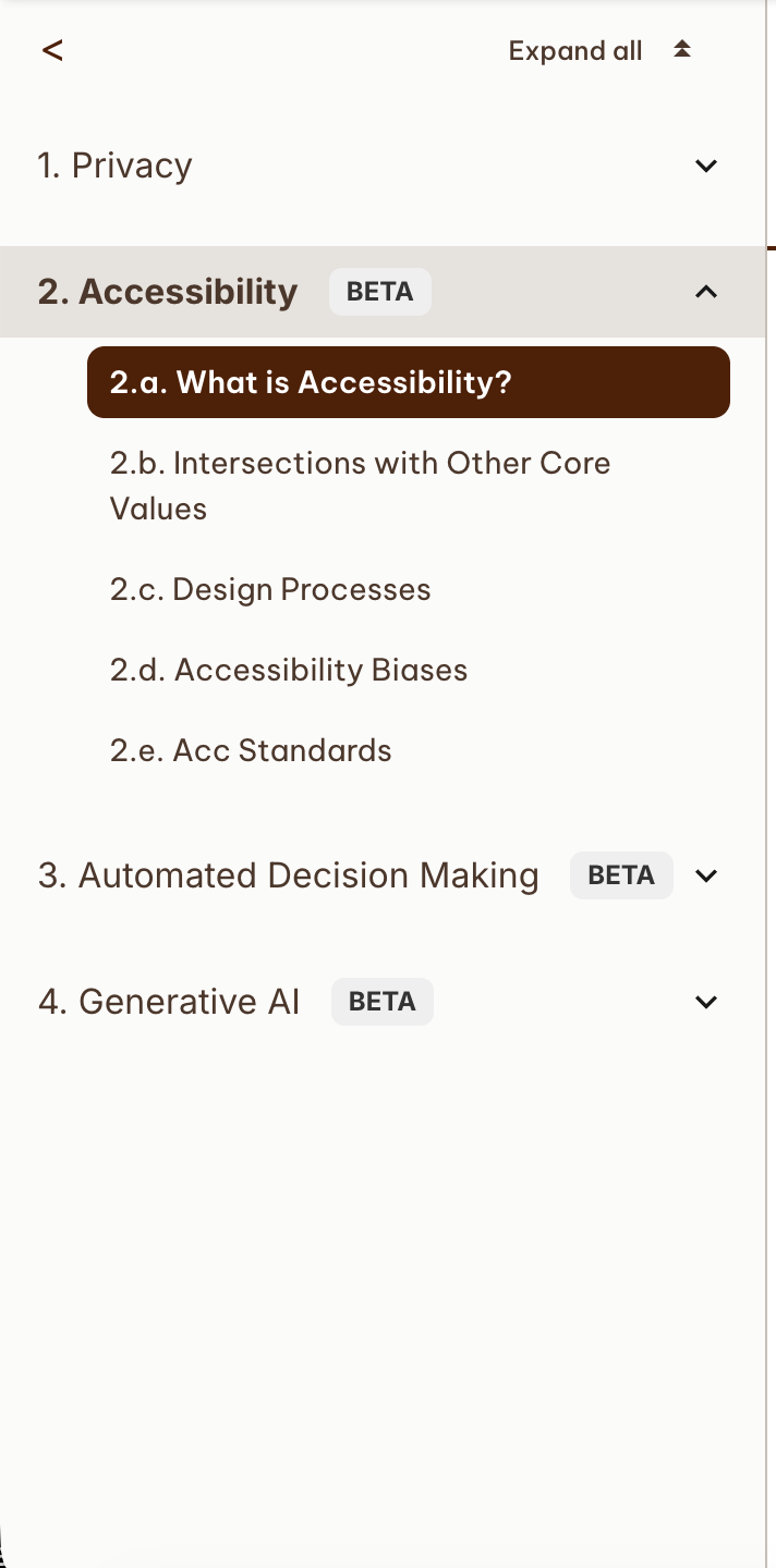
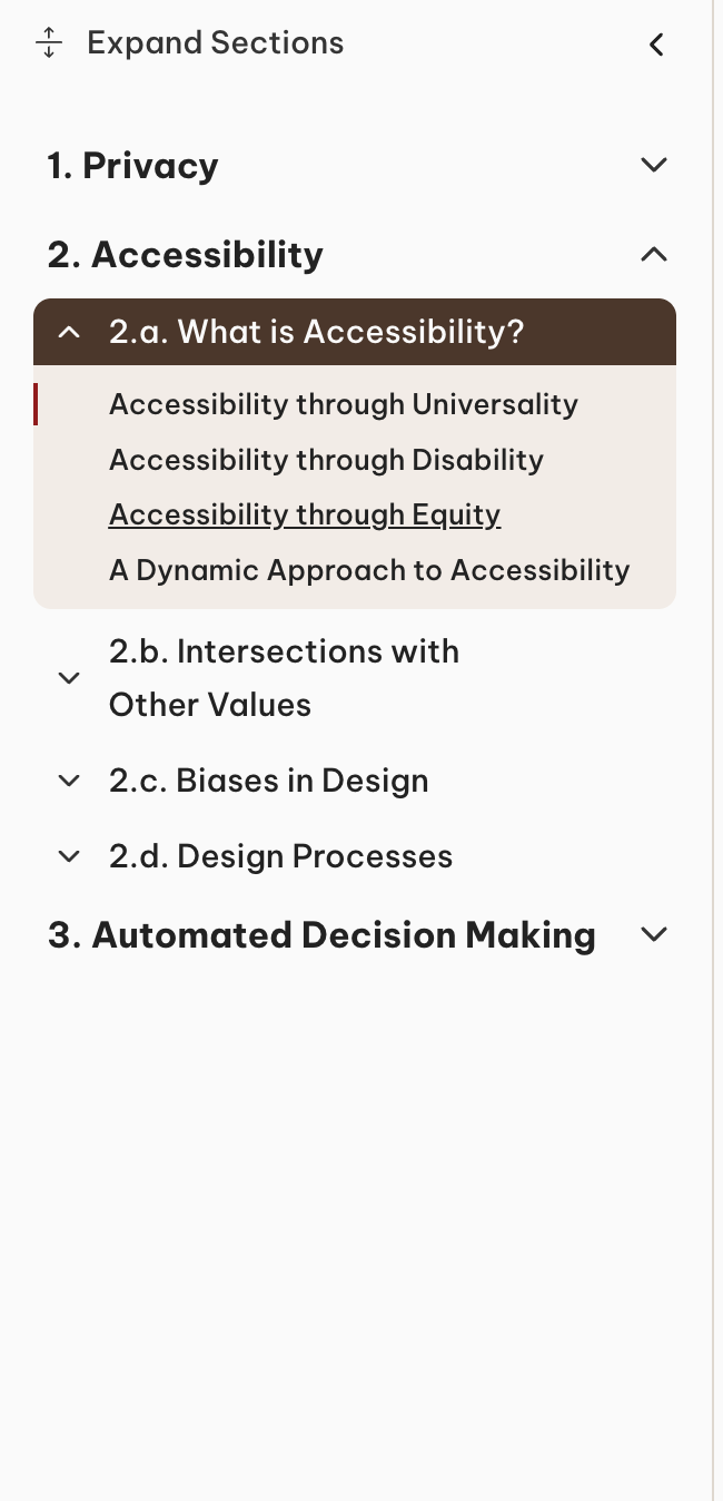
Sidebar navigationTheWeCo a11y testing
Nested accordion sections replaced a flat list for clearer keyboard and screen reader paths.
BeforeAfter
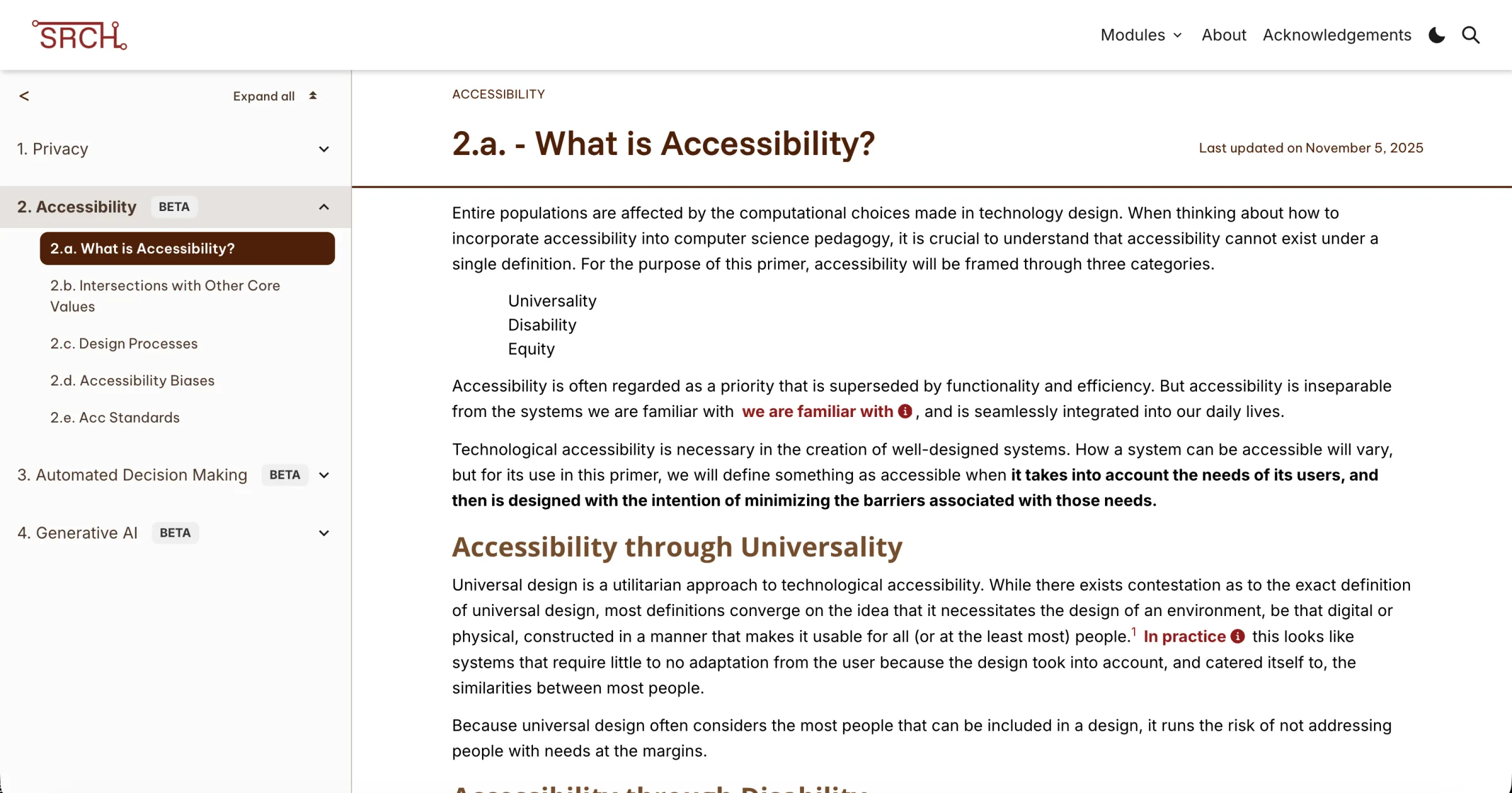
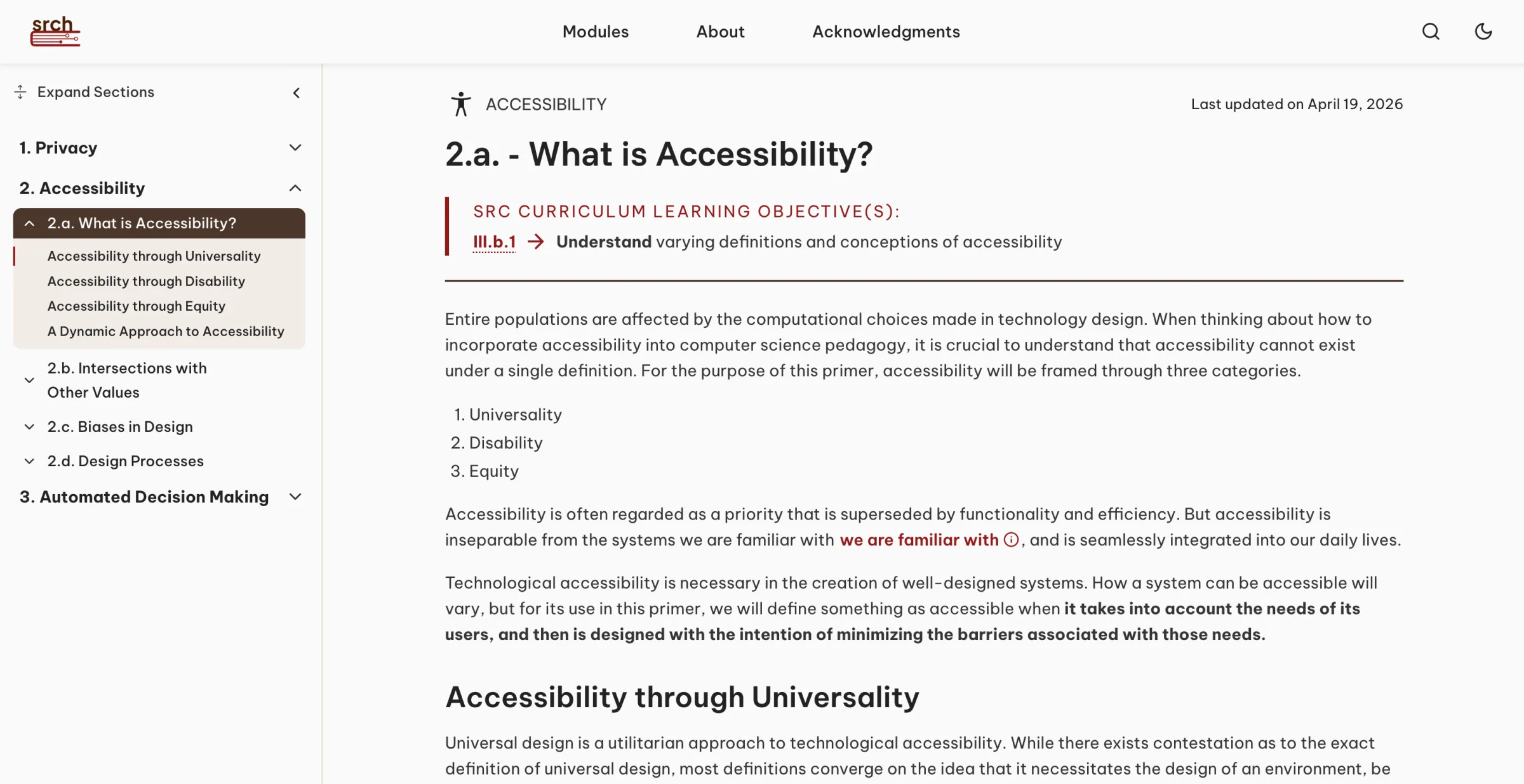
Primer layoutTheWeCo a11y testing
Learning objectives, clearer hierarchy, and an updated sidebar tied to primer structure.
BeforeAfter
Refining the Experience
Navigation
Layered wayfinding so users can browse, jump to a topic, and never feel trapped in a primer.
Multiple paths to find—and leave—content
Strategies
Handbook-wide search — find any primer or topic across the full handbook,
not only within the current page.
Collapsible sidebar — highlights the primer and section the user is in,
so orientation stays visible while reading.
Top progress bar — advances with scroll to show position within a long primer.
Modules dropdown in the nav — jump between core modules without backing out
of the reading experience.
Multiple entry points — open primers from the homepage, search, or from
within another primer so movement stays open in every direction.
Why
Instructors and students arrive with different goals: browse a module, jump to a topic, or
keep place while reading. One path isn’t enough—so finding and wayfinding were designed as
overlapping strategies, and primers stay reachable so users are never trapped.
Reading Experience
Long-form primers needed clear pacing and in-context support without breaking reading flow.
Clarity without interruption
Why
Primers are long-form and concept-heavy. The layout needed to keep the main text clear and
paced—and support unfamiliar terminology without breaking reading flow.
Reading decisions
Sectioned structure — break content into scannable sections so readers can
pause, jump, and resume without losing the thread.
Type size & hierarchy — size and weight tuned for sustained on-screen
reading of academic material.
Right-sidebar case studies — pop-up case study panels explain unfamiliar
terms and examples beside the primer, so support stays available without interrupting
the main narrative.
Visual Assets
Diagrams and illustrations alongside primers to clarify dense socioethics concepts.
Concepts easier to grasp at a glance
Why
Dense socioethics concepts can be hard to grasp from text alone. I designed diagrams and
illustrations that sit alongside primers to clarify ideas, reduce cognitive load, and
visually support the written explanations.
Evidence
Bias in data and model curationInclusive design: granular controlStakeholder ecosystemLadder of citizen participationProcedural justice pillars
Reflections
Accessibility had to lead—contrast, color-vision checks, and readable modes—not land as a late visual polish step.
Testing with students and assistive-technology users surfaced issues automated checks couldn’t—then those findings drove concrete site improvements.
Moving from staff designer to lead meant owning brand, system, assets, and development support—not just mockups.
An educational product has to serve teaching workflows as clearly as it serves visual craft.
(I left this project when I graduated from Brown, and passed it on to a new designer and
developer so the handbook can stay updated as new sections are added!)